 Data and calculation errors have been at the root of a number of large-scale financial incidents. Nick Wienholt, a Sydney-based consultant specialising in quantitative and data engineering, argues why Excel is a sub-standard tool for numerical modelling, and what technologies should replace it.
The scenes from anti-austerity protests in southern Europe are still fresh memories for most people, and while the sound-bite friendly images of Athens streets engulfed in flames are a vivid testament to the anger generated by the Troika-imposed austerity in the southern Euro zone, the true impact is only now being measured with a number of new studies showing the incredible social cost of the policies (1).
The truly startling aspect of the whole austerity debacle is that it was based on an Excel error. The academic research that motivated the austerity program was exposed as flawed when an Excel calculation mistake was discovered that rendered the theory largely invalid – the basic error being that the full range of inputs for an equation was inadvertently missed and that including the extra cells invalidated the debt-to-GDP growth theory (2).
Excel has also been implicated as a culprit in the London whale saga (3), with manual copying of Value at Risk (VaR) data across spreadsheets, coupled with erroneous formulas, lowering volatility by a factor of two, and with it the VaR – implying the bank was less at risk than it really was.
Excel has a number of intractable problems that make it a poor tool for financial modelling:
Calculation flow is opaque, prone to fudges and mistakes, and tedious to debug
Modelling higher dimensions is hard-to-impossible
The binary file format makes versioning difficult
Execution of the Excel models in production environments is fraught with technical and licensing issues
Modern modelling and analysis toolkits are lacking – Excel isn’t a tool that attracts innovation
The size of data that can be modelled and analysed is limited by column and row widths
The reason Excel is still used comes down to two factors:
It presents an incredibly low barrier to entry, and due to that;
It has a strong and established community of practitioners
While it is highly probable that many current Excel users will be able to wind down their career without improving their skills, for young and motivated financial modellers, the time to broaden their technical skill set is right now; as in this week. Five years ago the path off Excel wasn’t clear, but in the last few years a simple, viable and mature offering has emerged, gained widespread adoption and is now very ready for primetime.
Meet Jupyter Notebooks
Jupyter Notebooks are a browser-based technology that connects a simple, linear user interface (UI), which intersperses explanatory text with calculations and their associated output. The UI is connected to a back-end ‘kernel,’ which is simply an application that stores the current state of the notebook and performs the required calculations when a cell is executed. A notebook can also be saved with the generated output and archived as a text-only file.
A Jupyter server can be installed locally with the same simplicity as an Office install (and it’s free), and there are many hosted alternatives like Azure Notebooks (https://notebooks.azure.com/), Binder (https://mybinder.org/) and Google’s Cloud Datalab (https://cloud.google.com/datalab/).
The screen figure below shows all a very simple notebook, with descriptive text and live calculations interspersed together:
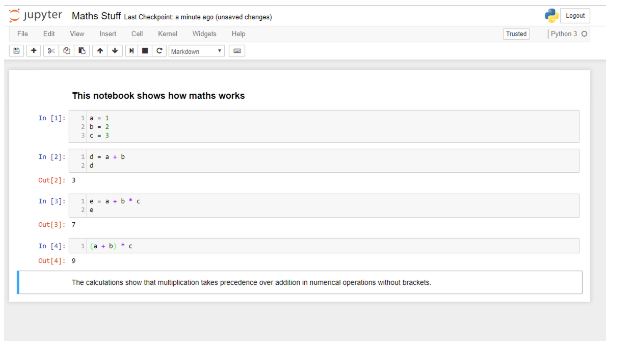
The first code cell has no output, but all subsequent cells do. Two markdown (text) cells bracket the code cells, but they can be interspersed anywhere. Graphical output – charts, images, sounds and movies is also possible. The language in this Jupyter notebook is Python, but dozens of different languages are supported. If you are new to Jupyter, learn Python. It is simple, and has the richest ecosystem of libraries, particularly for financial applications.
In contrast to Excel, automatic recalculation does not occur, but code execution options include:
Selecting a code cell and execute it with a Ctrl-Enter keystroke combination,
Run all cells above or below the current cell, or;
Run the entire document.
The current lack of optional auto-recalculate is not optimal, and addressing it is an active area of academic and commercial success. The current timeline for this feature is around the 12-18 month time frame.
“But”, I hear you scream, “my logic and modelling is so complex I could never express it in a silly browser?” Luckily Jupyter has been battle-tested on some incredibly non-trivial data analysis tasks – like winning a Nobel Prize in Physics for ‘Observation of Gravitational Waves from a Binary Black Hole Merger’. If your analysis is more advanced than proving the existence of gravitational waves in black holes, then sticking with Excel may be justified, but otherwise… The Notebook that proves the existence of the gravitational waves from the raw data can be run online through the Ligo Open Science Centre (LOSC) (4), and is a great example of the power of Jupyter.
If you still aren’t convinced, at the other end of the intellectual spectrum from Nobel physics, digital media and entertainment business Buzzfeed, is also a big user of Jupyter and has used it to demonstrate gambling-related corruption in tennis (5).
Looking at advanced Notebooks like the LOSC and Buzzfeed analyses, the advantage over Excel is readily apparent. The calculations are clean, transparent and quickly reproducible. There is complete separation between data and formulas, beautiful graphics can be produced, and the output of the calculations can readily be displayed on Github or the many other websites than have Jupyter renderers. For in-house analysis, a Confluence plug-in exists to share results.
But Wait, There’s More
The advantage of Jupyter is so self-evident that any risk department that doesn’t have a plan to transition off Excel in the medium term risks being viewed as negligent. The disadvantages (re-training, regression testing, retention) are heavily outweighed by the benefits (version control, reproducibility, vendor independence, traceability). The argument – ‘oh, we’ve learned to work around all the issues’ can be equally applied to all sub-optimal tools, and having external investigations like those carried out following the case of the ‘London Whale’, highlight Excel as an enabling technology for billion-dollar losses.
The advantage of a data-centric culture is exemplified by Netflix. Depending on the mood of the Nasdaq, Netflix is (or close to) the most valuable media company in the world. Netflix has a data obsession famously celebrated by giving away USD 1 million to external teams that could produce a system that beat Netflix’s movie recommenders by a few percent.
Netflix is a heavy innovator in the Jupyter space, and has recently open-sourced a toolkit that support the parameterisation and production execution of Jupyter Notebooks. The primary idea is that data scientists write their analysis and algorithms in Notebooks (which are increasingly their primary work toolkit), and these Notebooks are executed in production as modules. The overall toolkit is known as ‘Sawmill’ (6).
This technology is incredibly exciting. Data science industrialisation has proven to be a very expensive and error-prone activity to accomplish. Sawmill has the potential to dramatically decrease the on-ramp steepness – any competent data scientist can use Jupyter, and Sawmill allows operations teams to get these Notebooks functioning in production without building their own custom pipelines.
Getting Started
Jupyter and Python have a gentle learning curve. For local use, install Anaconda (7), and plenty of free online learning resources exist. Open-source tools for data science (8) is a great introduction. The great news is that it is a relatively new field and anyone starting now isn’t at a significant experience disadvantage. Start today and the benefits will flow very quickly. Now is a great time to begin this journey.
This article was prepared by Nick Wienholt in his personal capacity. The views and opinions expressed in this article are the author’s own and do not reflect the views of the publisher, its owners or employees. Fund Business accepts no responsibility for the content of this article, nor for the content of links provided in this article to third party websites.
About the author
Nick Wienholt is a consulting quantitative and data engineer based in Sydney. With a focus on the sport betting and financial markets, he enjoys helping clients not just with the conceptualisation of data solutions but also completing the much harder work of developing and productionising data pipelines that can generate meaningful market insights. Past clients include Kindred Group, Commsec and various proprietary trading firms. Nick is happy to discuss how data engineering and machine learning can improve your trading outcomes, and can be contacted at quant.click.
Appendices
‘Austerity and health: the impact in the UK and Europe’ – European Journal of Public Health, Volume 27, Issue suppl_4, 1 October 2017, Pages 18–21, https://academic.oup.com/eurpub/article/27/suppl_4/18/4430523
https://www.businessinsider.com.au/excel-partly-to-blame-for-trading-loss-2013-2
https://notebooks.azure.com/losc/libraries/tutorials/html/LOSC_Event_tutorial.ipynb
For a detailed description see: https://medium.com/netflix-techblog/notebook-innovation-591ee3221233
https://www.coursera.org/learn/open-source-tools-for-data-science